Project Overview
Key Impact
Bridged the gap between real-world inspiration and digital design by enabling instant color capture, palette generation, and project organization in one flow.
My Role
Problem
Designers constantly encounter inspiring colors in the real world but capturing and using that inspiration is surprisingly difficult.
Photos preserve the moment visually, but don’t provide usable color data. Existing tools are often too technical, disconnected from real world context, or unreliable in their results.
As a result, designers rely on memory, screenshots, or guesswork leading to lost inspiration, inconsistent color usage, and unnecessary friction in their workflow.

Key Insights
From the research, several clear themes emerged that directly informed Chroma’s design direction. First, users emphasized that capturing color needed to be fast and effortless; anything more than a quick tap would interrupt the inspiration moment. Second, many shared that once a photo was taken, the color often got lost in the chaos of their camera roll, never to be used or seen again. There was also a strong desire for control when it came to palette generation; users welcomed suggestions but wanted the flexibility to tweak or build on them. Finally, participants were comfortable with the idea of the app providing a “best match” rather than an exact color as long as the language was transparent and set the right expectations.
Competitive Analysis
To understand the competitive landscape, I analyzed three tools operating in the color capture and palette generation space: Adobe Capture, Coolors, and Pantone Connect. While each served its audience effectively, a clear pattern emerged. These tools were either too broad, too locked-in, or too standards-focused to serve a designer's moment of real-world inspiration. Adobe Capture offered the most versatile feature set, but its power depended entirely on being embedded in the Adobe ecosystem and offered no desktop counterpart. Coolors excelled at fast, intuitive palette generation and boasted a library of over 10 million community palettes, but it lacked any camera-based, real-world color capture and had no true team collaboration features. Pantone Connect held authority through its industry-standard color libraries and conversion tools, but its full functionality sat behind a paid subscription that frustrated the design community, and it remained narrowly focused on Pantone-specific tasks. Across all three, a consistent gap surfaced: none of them gave designers a frictionless way to capture color inspiration in the field, preserve it with context, and organize it directly into a usable project workflow. That gap became Chroma's core competitive advantage.
How might we create a workflow that helps designers turn real-world color inspiration into organized, usable palettes they can trust and revisit later?
Personas
After conducting interviews and based on the key demographics summary we were able to create our User Personas to find our ideal candidate.


Feature Priorities
To address the gap between real-world inspiration and usable color data, I designed Chroma as a mobile-first, camera-driven experience that prioritizes speed, accuracy, and organization.
The core idea was simple: capture inspiration the moment it happens and immediately make it usable.
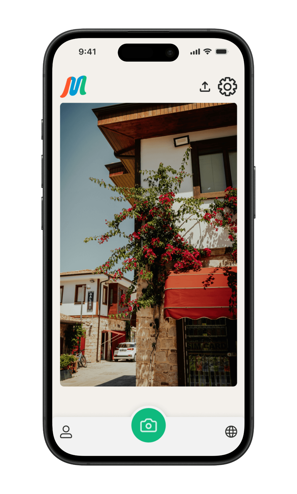
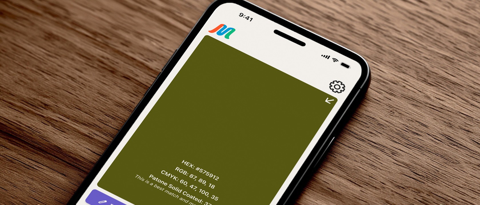
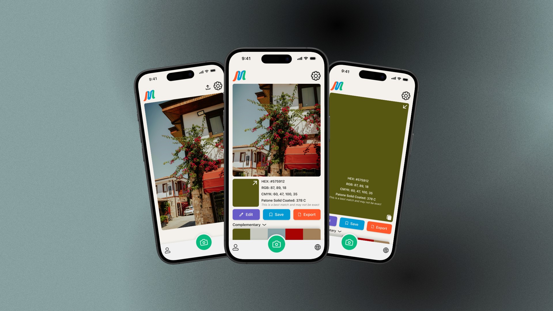
Instead of forcing users through complex tools or manual workflows, Chroma centers around a camera-first interaction model. Designers can quickly capture a scene, extract accurate color data (HEX, RGB, CMYK, and Pantone best matches), and generate structured palettes that can be edited, saved, and reused.
The experience was designed to reduce friction at every step, from capture to export, so that inspiration isn’t lost and color becomes part of an active design workflow rather than a passive reference.
Camera-first capture:
Designers needed a fast, intuitive way to capture color in context.
By prioritizing the camera as the primary interaction, users can go from inspiration to usable data in seconds, without navigating complex menus.
Automatic palette generation with manual control:
While automation speeds up the process, designers still want control.
Chroma generates palettes instantly, but allows users to refine, edit, and adjust colors balancing efficiency with creative ownership.
Accurate, multi-format color data:
Designers work across tools and mediums.
Providing HEX, RGB, CMYK, and Pantone best matches ensures captured colors are immediately usable in both digital and print workflows.
Project-based organization:
Inspiration often gets lost after capture.
Organizing palettes into project-based collections allows designers to revisit and reuse colors within a structured workflow.
Harmony exploration:
To support creative expansion, users can switch between harmony types (analogous, complementary, etc.), turning a single captured color into a broader palette system.
Export and integration:
Captured colors are only valuable if they can be used.
Quick export options (Figma, Adobe, copy values) ensure palettes move seamlessly into real design workflows.
Discovery and inspiration:
Beyond capture, Chroma introduces a discovery layer where users can explore shared palettes bridging personal inspiration with community driven creativity.
Information Architecture
To ensure Chroma felt fast and intuitive, I focused on structuring the app around its core user actions: capturing color, organizing palettes, and reusing them in real workflows.
I defined a clear architecture built around four primary areas:
Capture, Projects,Palette Viewer, and Export
Each designed to support a specific stage in the user’s workflow. This structure prioritizes speed and reduces cognitive load by keeping the most important actions immediately accessible.
By mapping these relationships early, I was able to simplify navigation and eliminate unnecessary steps between key actions. For example, capturing a photo flows directly into palette generation and saving, reinforcing a seamless transition from inspiration to usable output.
This approach ensured that Chroma’s structure supports how designers actually work, moving quickly from discovery to application, without forcing them through complex or disconnected workflows.
User Flow
With our Personas in mind, I was able to create a User Flow that was instrumental in defining how Chroma supports the specific needs of users. For designers like Marcus, the flow made it clear how quickly he could go from capturing a color in the real world to generating a usable palette for a branding project. This reinforces the app’s role in fast, inspiration-driven workflows. For Priya the User Flow outlined how she could locate a previously saved palette and export it to share with her team, helping bridge early color and palette discovery with collaborative decision-making.

Wireframes
Low-fidelity wireframes were used to rapidly explore and validate the core interactions within Chroma particularly around color capture, palette generation, and project organization.
By stripping away visual detail, I was able to focus on structure, hierarchy, and flow, and ensuring that key actions like capturing a color, saving a palette, and exporting data were immediately clear and accessible. This helped identify friction early and allowed for quick iteration before committing to final UI decisions.
These wireframes also clarified how users move from inspiration to output, reinforcing a seamless transition between capturing a moment and turning it into a usable design asset.
The progression from low-fidelity to final UI reflects how early structural decisions were refined—not reinvented—resulting in a more intuitive and efficient experience.
This approach ensured that visual design enhanced usability, rather than compensating for structural issues.

Branding & Design System
Chroma’s brand was designed to position it as more than a utility, it needed to feel like a creative companion that designers could trust in their workflow.
The visual identity reflects clarity, precision, and approachability, balancing technical accuracy with an accessible, creative tone. This was critical to ensure the product didn’t feel overly complex or clinical, despite working with detailed color data.
The name Chroma—rooted in color theory as a measure of intensity and purity—informed the visual direction. I intentionally leaned into saturated, high-contrast color to create a sense of vibrancy and immediacy, reinforcing the idea of capturing inspiration in its most vivid form.
Beyond branding, I established a lightweight design system to ensure consistency across the product. This included a defined color hierarchy, typography scale, and reusable UI components that support clarity and speed of interaction.
The system was designed to scale with the product—ensuring that as features expand, the experience remains cohesive, predictable, and easy to navigate.
#F3F0EB
#262626
#685BC7
#0087BA
#FE572A
#0FBA7E
SF Pro Display
H2
SemiBold
16 Pt
P1
Regular
16 Pt
P2
Regular
15 Pt
P3
SemiBold
14 Pt
SF Pro was chosen for its clarity and familiarity, supporting quick, effortless reading across the interface.


Results & Impact
Usability testing validated that Chroma’s core experience aligned well with how designers naturally gather inspiration. Participants were able to view color values and save palettes to collections with minimal friction, confirming the strength of the camera-first workflow.
Testing also revealed key areas for improvement. Some users needed prompting to complete actions, experienced confusion around where captured colors were stored, and struggled to locate features like “save to collection” and export. Inconsistent icon clarity and placement further contributed to uncertainty in key workflows.
These insights directly informed iterative refinements. The “save” action was redesigned for clearer intent, export functionality was repositioned for better visibility, and additional visual cues were introduced to reinforce system feedback. Navigation clarity was also improved to better distinguish between capture, profile, and collection states.
As a result, the final prototype delivers a faster, more intuitive experience that reduces ambiguity and supports designers’ real-world workflows. Chroma successfully bridges the gap between spontaneous inspiration and structured design output. This allows users to capture, organize, and reuse color without breaking creative momentum.