About Featured All Work Contact

Modernizing a beloved local coffee brand's digital ecosystem from legacy WordPress to a scalable, mobile-first Shopify experience.

ShadrachsCoffee.com
Web/Product Design Product & UX Design Lead Branding Shopify
Visual
Menu System
Mobile
First Design
Zero
Broken Links
Shadrachs Coffee interface on laptop and phone
Shadrachs Coffee brand imagery

Problem — Solution

The Logic Stack

Every design decision traced back to a specific user pain point and validated through measurable outcomes.

Friction Products listed as a flat text list with no visual hierarchy — users couldn't scan or discover new items
Solution Introduced a visual category-based menu system with product imagery and clear labels
Validation Customers found it easier to browse, customize, and choose drinks quickly — recognition over recall
Friction Persistent bottom 'Menu' CTA consumed mobile screen real estate, crowding content and reducing viewing area
Solution Moved navigation into a standard mobile drawer, freeing screen space for content and product imagery
Validation Increased effective viewing area on mobile; created a modern, scalable navigation pattern
Friction Legacy QR codes on trailers, ads, and print collateral pointed to old WordPress URLs that would break after migration
Solution Implemented comprehensive redirect strategy mapping all legacy URLs to new Shopify equivalents
Validation Zero broken links, all existing physical marketing materials remained fully functional post-migration
Friction Subscription data couldn't be seamlessly transferred; customer accounts fragmented across systems
Solution Coordinated subscriber outreach and guided re-enrollment; centralized customer data in Shopify
Validation Internal team gained clearer reporting, centralized data, and improved subscription visibility
Friction Inconsistent layout patterns and poorly optimized touch targets on mobile devices
Solution Mobile-first redesign with improved button visibility, interaction hierarchy, and touch accessibility
Validation Key actions became easier to locate and reach on smaller screens reducing journey friction
Shadrachs coffee bag product lineup

Process

From Audit to Launch

Audit & Research
Analyzed legacy WordPress site, mapped user friction points across customer and internal stakeholder journeys. Identified mobile usability gaps and content management bottlenecks.
Information Architecture
Restructured navigation from persistent bottom CTA to standard drawer pattern. Reorganized product hierarchy to surface high-interest items and reduce cognitive load.
Visual System & UI
Created visual category-based menu system replacing text lists. Designed mobile-first layouts with improved touch targets, spacing, and product imagery prominence.
Shopify Launch
Executed WordPress to Shopify migration. Implemented comprehensive URL redirect strategy for QR code compatibility. Coordinated subscription customer re-enrollment.
Old WordPress site compared with the new Shopify design

Design Craft

Component Anatomy

Key design decisions that transformed the browsing experience from functional to delightful.

Component anatomy of the Shadrachs menu screens
Recognition over recall
Visual Category System
Replaced text-based product lists with image-driven category cards. Users scan drink types through photography and clear labels instead of reading through menus.
Mobile-first priority
Reclaimed Screen Space
Removed the persistent bottom CTA bar and moved navigation into a drawer. This returned ~15% of viewport height back to content and product discovery.
Surfaced high-interest items
Product Hierarchy
Signature drinks and coffee beans elevated to prominent positions. Clear product groupings support both casual browsing and efficient repeat ordering.

Results

Impact & Outcomes

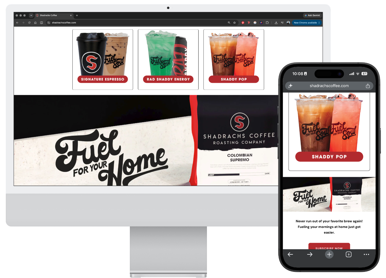
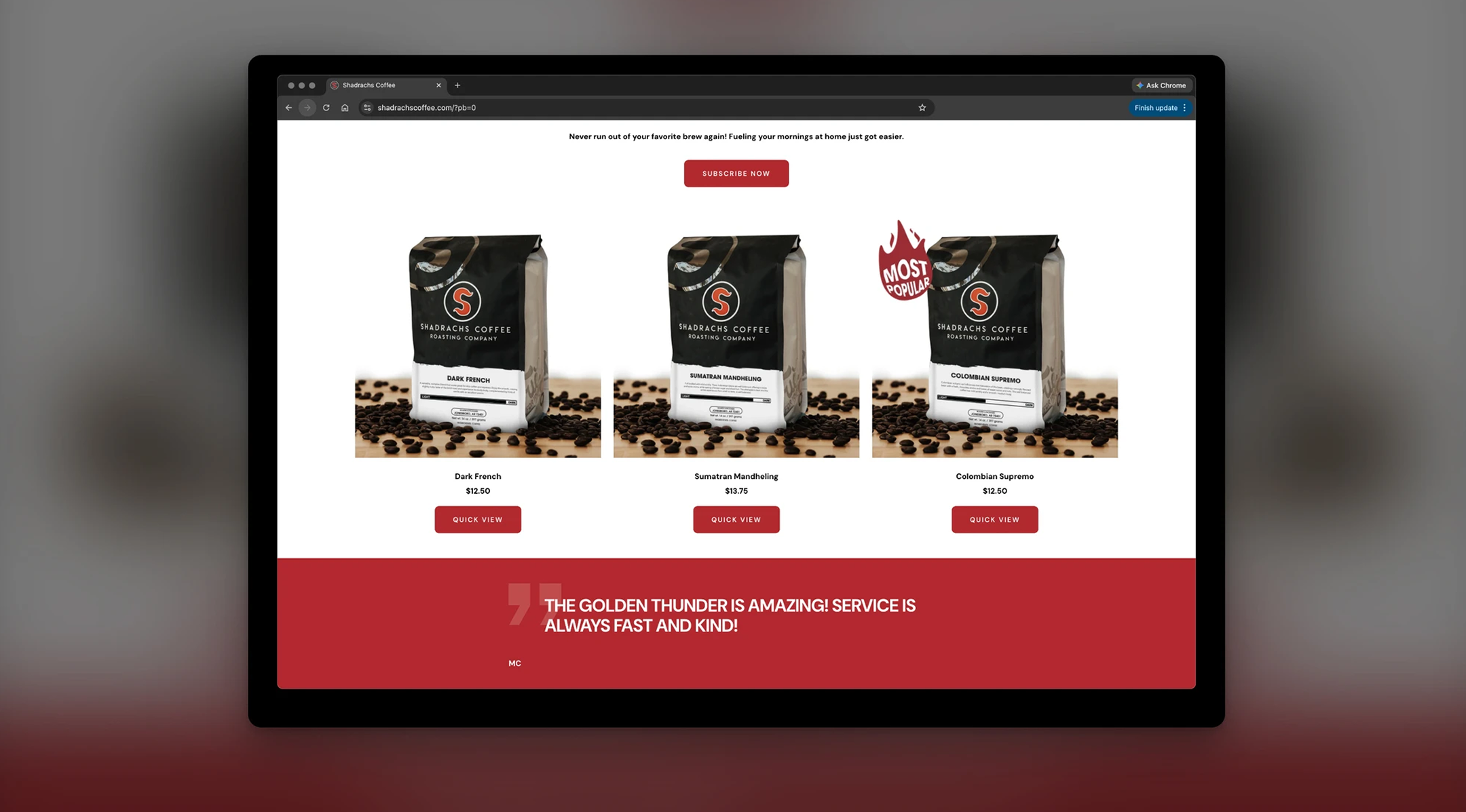
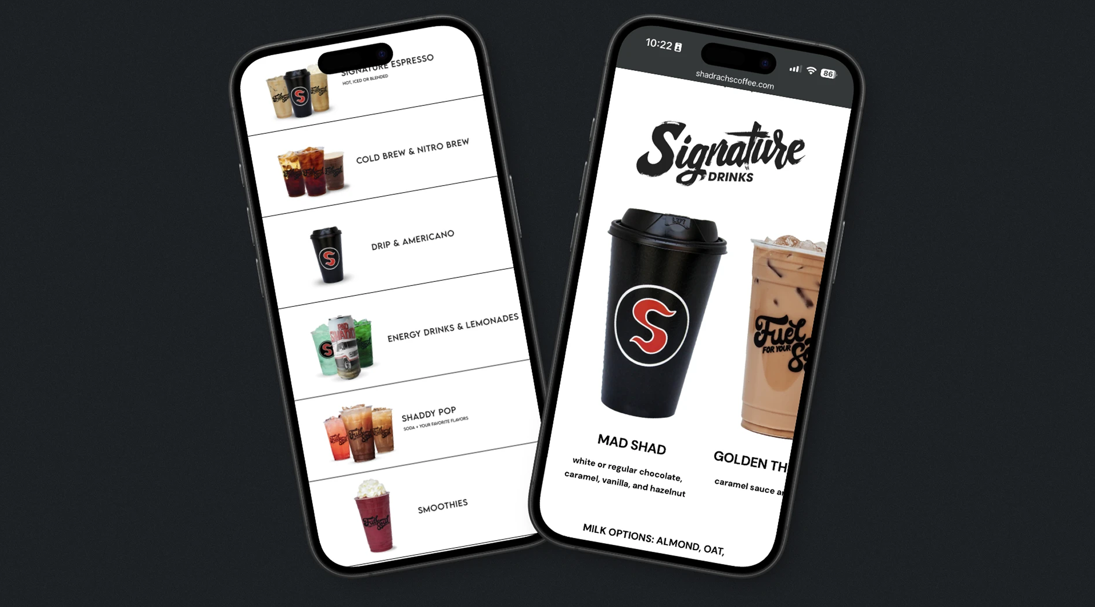
Improved Product Discoverability
Transforming the menu from a text-based list into a visual category system significantly improved how customers browse available drinks. The new layout allows users to quickly scan drink categories through imagery and clear labeling, reducing the effort required to locate specific items or explore new offerings.
Clearer Information Architecture
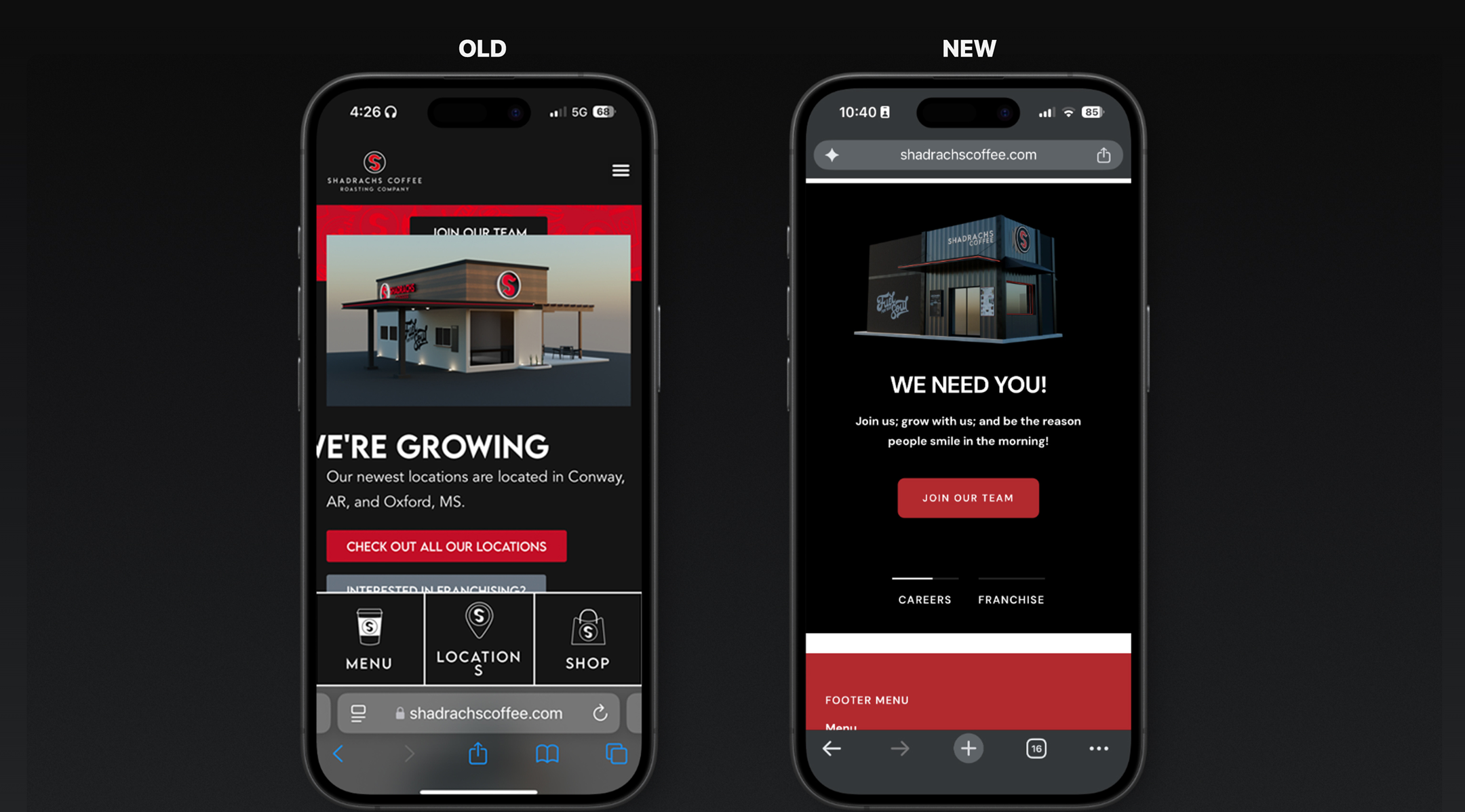
The redesigned navigation structure simplified how users move through the site. By consolidating navigation into a mobile-friendly menu and removing persistent interface elements, the redesign increased usable screen space and created a more balanced visual hierarchy. This allows customers to focus on content and product information rather than interface controls.
Mobile Experience Improvements
The new implementation prioritized mobile usability by improving touch targets, simplifying navigation patterns, and reducing visual clutter. Key actions such as viewing menu items, browsing products, and accessing location information are now easier to locate and interact with on smaller screens.
Operational Efficiency for Internal Teams
Migrating to Shopify provided the team with a more scalable and manageable platform for maintaining the site. Product listings, location updates, and customer data can now be managed through a centralized dashboard, reducing reliance on manual updates and improving day-to-day operational efficiency.
Seamless Platform Transition
Through careful redirect planning and URL mapping, the migration preserved compatibility with existing QR codes and marketing materials already deployed across physical locations and promotional campaigns. Customers scanning legacy QR codes are automatically routed to the correct pages on the new site, ensuring continuity between physical and digital experiences.
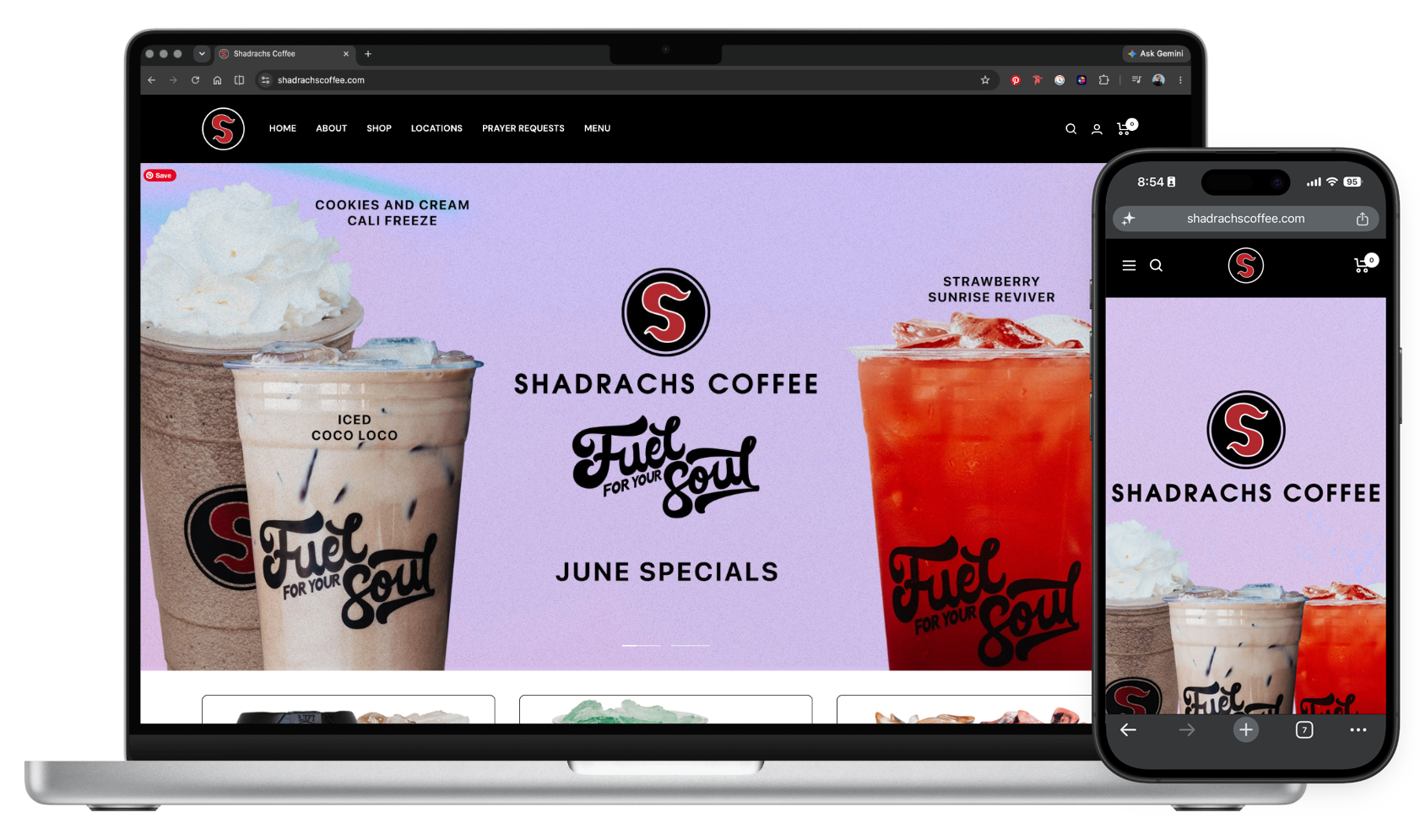
Stronger Brand Presentation
The redesign established a more cohesive digital brand presence through improved typography, imagery, and layout consistency. By shifting from a purely functional layout to a visually driven experience, the website better reflects the energy and identity of the Shadrachs brand.
Key Impact Statement

Improved menu discoverability and decision speed by transforming a static list into a visually guided, mobile-first browsing experience.